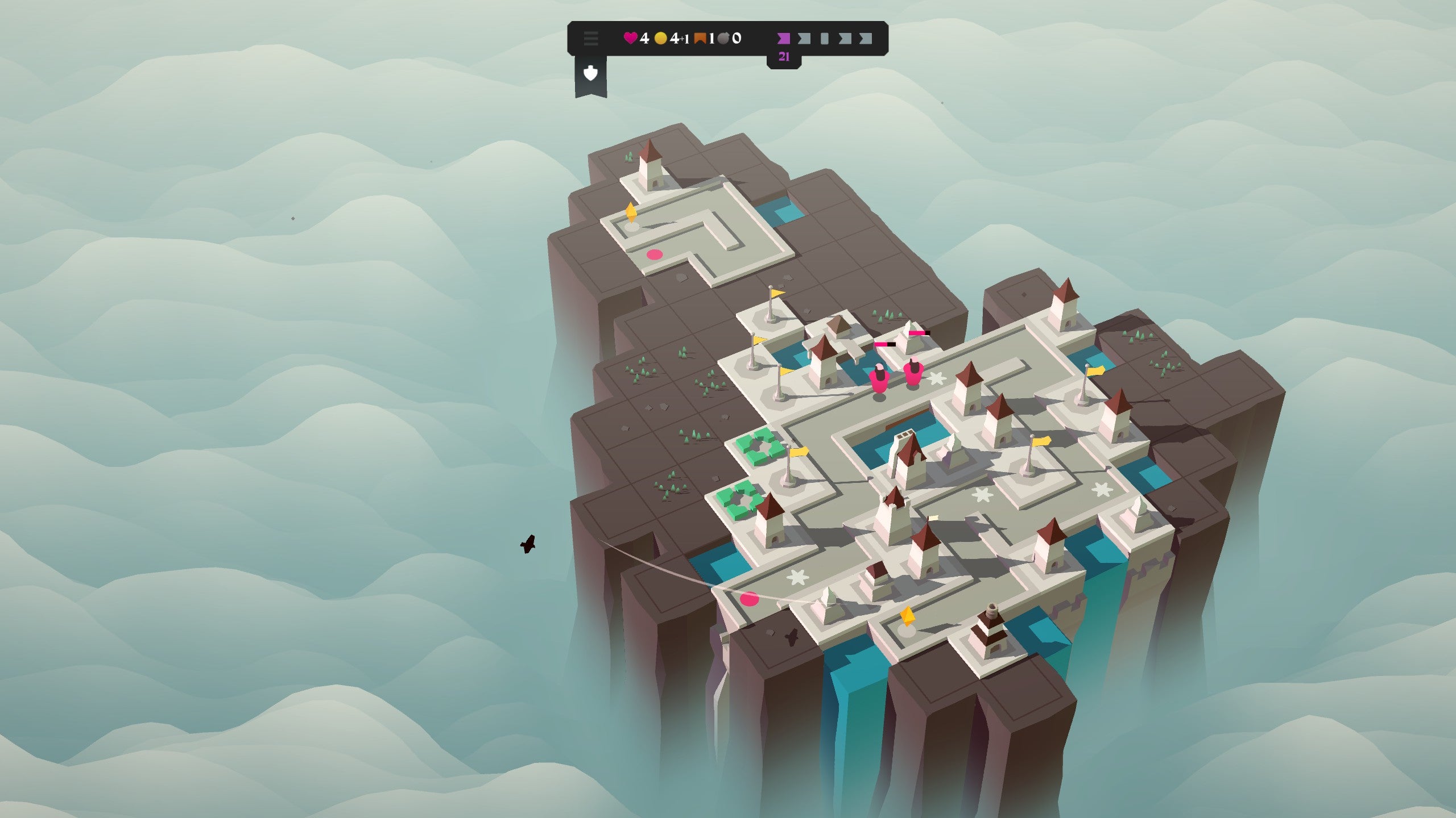
Isle of Arrows has an idea: a second base. Just as you’re beginning to slouch and get comfortable, it introduces another base, and it’s like starting all over again but at the same time as managing something else. Only now, you have one pool of resources to spread across both bases. Even more importantly: both bases share the same overall health pool. If enemies get through to your core in either one, you’ll take damage, and as you only have about 10 hearts, and one life, this is important. In other words, the danger is doubled, and if you ignore one base for the other, and allow a bad situation to fester, you could quickly find yourself in a precarious situation indeed. But Isle of Arrows doesn’t stop there with the ideas: it also plays around heavily with space. You know how in a typical tower defence game, the space you defend is usually defined and set? Well here, it’s not. By laying new paths you can extend the runway enemies have to walk down, therefore increasing the distance and time it takes for them to reach your core. You can also wind paths around defences, getting maximum usage out of them. It’s not, however, as easy as it sounds. It’s all governed by cards - Isle of Arrows is, partially, a card game. Each turn, you pull a card, and on it could be a section of path or a building, and providing you can fit it into your tiled space, you can play it. If you can’t or don’t want to, you can end your turn there and begin the next wave - it’s turn-based in that regard - or spend some of your limited coins to play the next card from your pack. Soon, though, playing space will run out, which is bad, because enemies will always get more numerous and tougher, and unless you’ve increased their walk distance and amount of defences you have, you will die. Your options, then, are enlarging your island - hence the ‘Isle’ part of the name - or destroying buildings and putting new ones down, or building bridges. And again, all of this is done with cards, and the cards have certain tactical drawbacks. I won’t go into too much detail for fear of bogging this down but suffice to say: the detail is there. Don’t let the ultra-clean, simplified look fool you, there’s a real challenge here. I’m less of a fan of the mobile-style presentation though. It feels awkward controlling it on PC, like it doesn’t quite fit there, despite it actually only being available on PC at the moment and not mobiles, where it launches early October. That minor gripe aside, though, I like it.
